Contrast in photography [2025]
How to Use Different Types of Contrast in Photography
Contrast is one of the most important features of a photo and represents the difference between two adjacent elements. A photo may be considered a collection of points with different amounts of brightness and color. At the same time, a photo may be considered a collection of geometric elements such as shapes and lines. Last but not least, a photo may be considered a collection of subject matter such as people, objects, sky, and forest. Contrast is a concept that applies to all these elements, irrespective of their importance.
Contrast ranges from low (a small perceived difference between two adjacent elements) to high (a large perceived difference between two adjacent elements). Each level of contrast creates a specific mood and has its role in creating a well-balanced composition and an interesting photo. For example, low contrast is associated with soft, dreamy moods, while high contrast is dramatic and impetuous. You should consider contrast from the moment you take a photo and not just during photo editing.
Include contrast in your compositions
In photography, there are four types of contrast. Tonal and color contrast refer to the smallest elements of a photo: points with luminance and hue. Pattern contrast refers to larger areas of a photo and is deeply connected with geometric features. Conceptual contrast refers to objects or abstract concepts with significance to people. Here’s everything you need to know to compose your photos with contrast in mind.
Tonal contrast
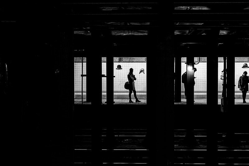
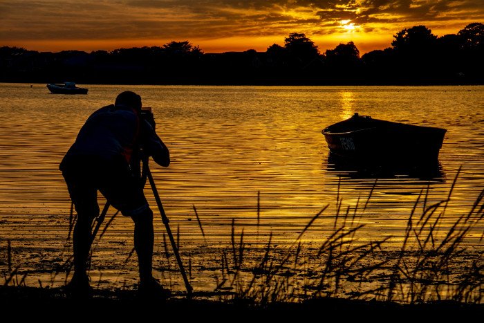
Tonal contrast represents the difference in luminance between two adjacent points. It’s the basic contrast between white and dark points, bright and dark areas of the image, shadows and highlights. Tonal contrast is connected to the image’s dynamic range and is an important part of achieving photos with good exposure. Most of the time, you’ll want sharp images that are well exposed and with a wide dynamic range. But for artistic purposes, you may also want low-key or high-key photos (photos with very low tonal contrast) or photos with high tonal contrast (for example, dramatic black and white photos).
Color contrast
Color contrast represents the visual difference between colors. The highest contrast is created by complementary colors, or colors that cancel each other when mixed and produce white or black. The most popular color system in digital photography, RGB, has red–green, yellow–purple, and orange–blue pairs of complementary colors. The CMY color system, used in printers, has red–cyan, green–magenta, and yellow–blue pairs. You can find out the level of contrast between two colors using the color wheel, a chart that represents the relationships between colors and that is attributed to Sir Isaac Newton.

Pattern contrast
Differences in the orientation of patterns change the weight of elements and impact the composition. Pattern contrast is frequently used in architecture, fashion, and commercial photography. It emphasizes the properties of surfaces and materials and attracts the viewer towards a specific part of the image. Although you can add textures and change patterns in post-processing, pattern contrast works best when created directly in the camera.
Conceptual contrast
Conceptual contrast relates to messages conveyed by your subject matter. It’s determined by commonly accepted concepts but also by how each viewer interprets your photo. For example, such as old/young, rich/poor, healthy/sick, happy/sad, beautiful/ugly, and clean/dirty create conceptual contrast. You can find a long list of converses that enhance a composition solely through.
Adjust tonal and color contrast in post-processing
Tonal and color contrast can be adjusted using a photo editor. Most editors allow you to control the difference between bright and dark areas of the image and increase or decrease tonal contrast. You can also adjust hue and saturation, replace colors, and control individual color channels.
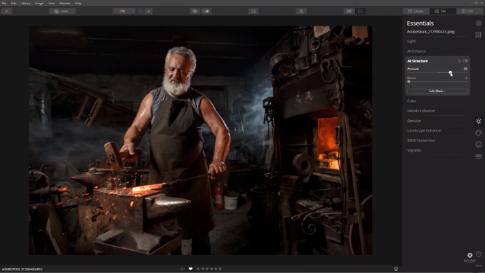
Editors like Luminar go even further and provide advanced contrast tools that allow you to individually adjust highlights, midtones, and shadows. Moreover, Luminar AI lets you decide which areas are treated as highlights, midtones, and shadows. The result is sharp, natural-looking images and endless possibilities to achieve your artistic vision.
Luminar AI also allows you to enhance color contrast. All you have to do is choose a color you want to lighten and the complementary color will automatically be darkened. You control the amount and the hue of the effect. Other color adjustments are also available, such as color balance, tone, color warmth, and hue shift.
Do you need special equipment to achieve contrast in photography?
Contrast isn’t just a matter of light and shadows, perfect exposure, and sharp details. It’s also a matter of composition, working with juxtaposition, and choosing the right elements and the best angle for your frame. It starts in the camera and ends in post-processing.
Choose an image editor dedicated to photography that provides a wide range of tools for editing contrast. Luminar’s Smart Contrast tool automatically enhances contrast while preserving colors and details. At the same time, it includes advanced tools for adjusting each aspect of an image: highlights, shadows, midtones, hue, saturation, brightness, and tone. No matter what software you pick, look for a complete solution that allows you to transform your vision into reality, deliver high-quality images, and implement both subtle adjustments and spectacular effects.
 Previous Post
 Next Post